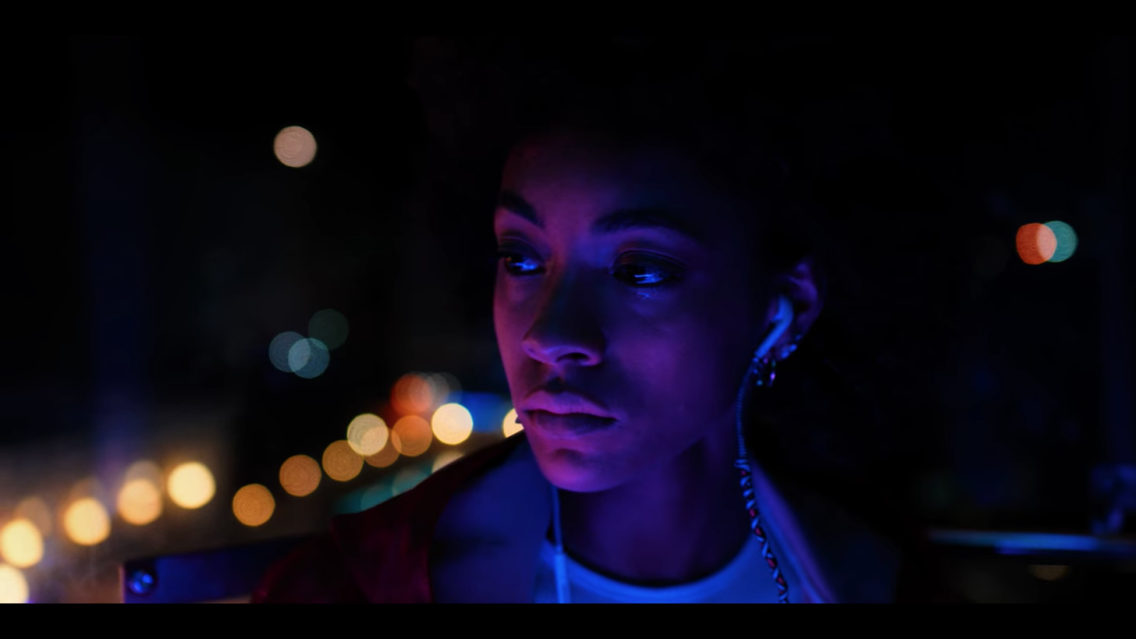
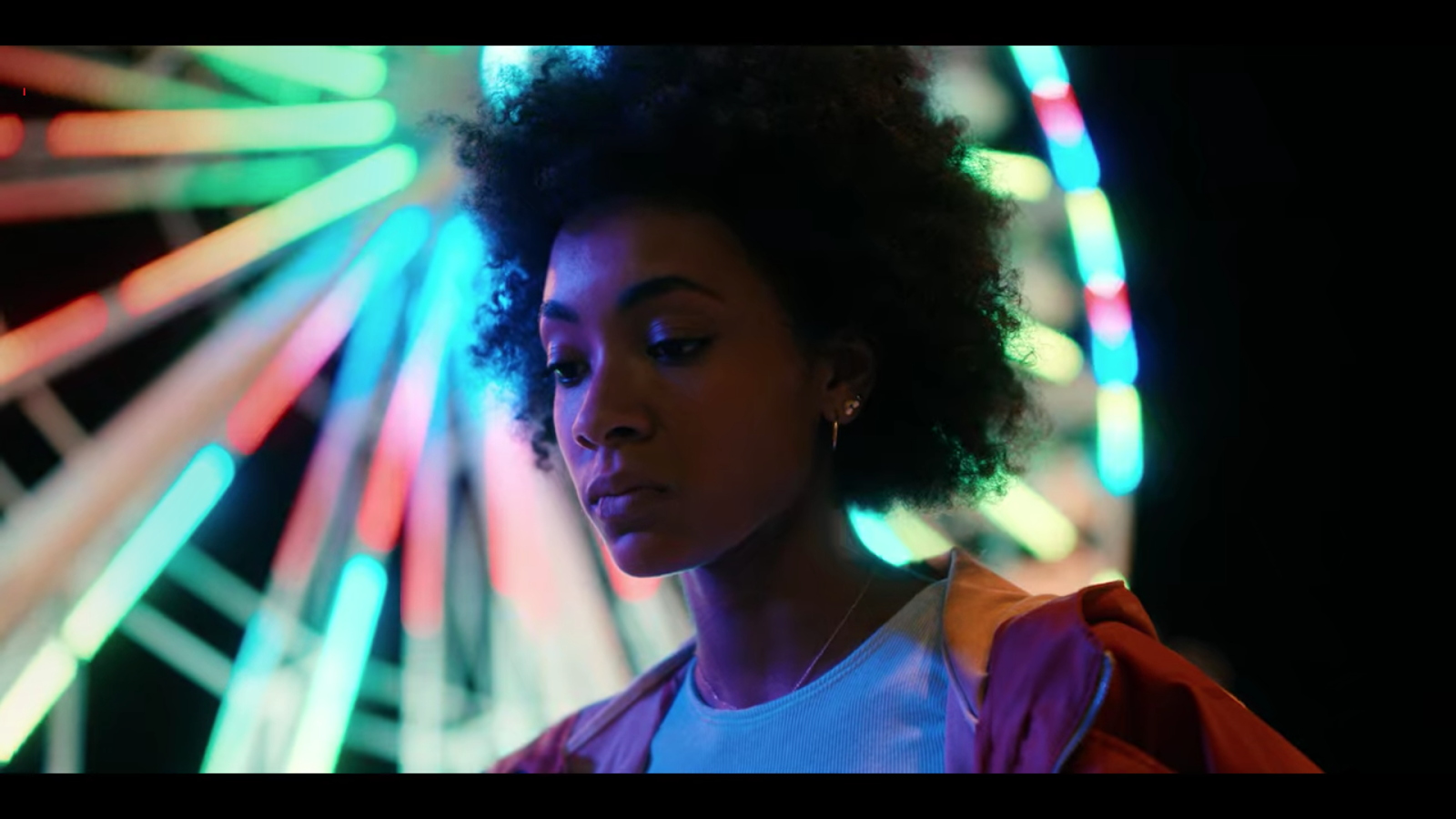
Affichage des articles dont le libellé est Analyse d'un film. Afficher tous les articles

26 janvier 2022

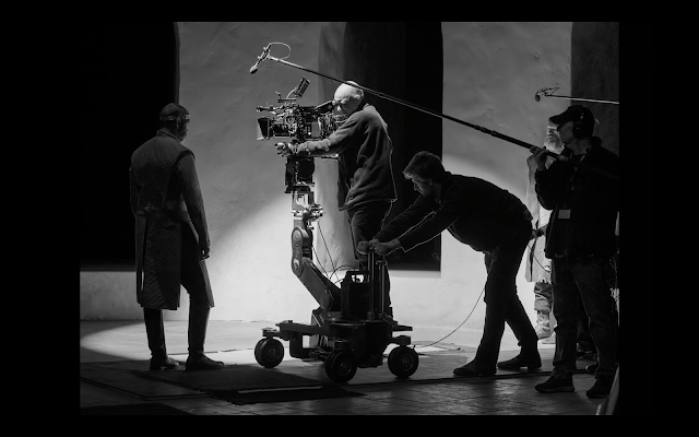
Le Making Of de Macbeth

En bref  Le making-of de « Macbeth » s'adresse aux votants des Oscars mais révèle aussi la part de chaque département dans ce film exceptionnel. Quelques passages furtifs montrent le set-up lumière de Bruno Delbonnel — trop furtifs pour moi, qui en voudrais davantage.


Bien sûr, ce Making Of s'adresse surtout aux votants des Oscars, et illustre avec force superlatifs le travail d'équipe qui a conduit à ce film… exceptionnel.
Mais c'est aussi un bon moyen d'évaluer la part de travail de chacun, et la totale motivation des divers départements impliqués. 
Quelques passages furtifs montrent le set-up lumière de Bruno Delbonnel. Vivement les Oscars!

19 janvier 2022

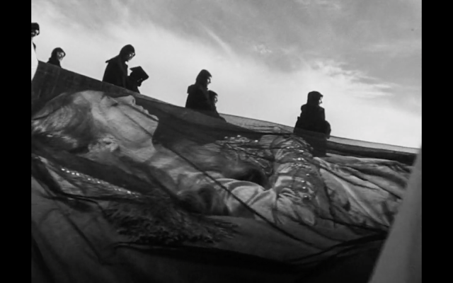
Macbeth inspire à Delbonnel un Noir et Blanc limpide, et prodigieusement beau

En bref  « La Tragédie de Macbeth » de Joel Coen, photographié par Bruno Delbonnel en couleurs sur Arri LF puis post-produit en noir et blanc, est un chef-d'œuvre visuel. Chaque plan s'impose par sa justesse et s'imprime dans la mémoire. Delbonnel, habitué aux films hauts en couleurs, prouve que le noir et blanc n'est pas une soustraction mais un langage en soi — plus graphique, plus essentiel.


Tourné en couleurs sur Arri LF avec des Cooke S7 puis post-produit en Noir et Blanc, "La Tragédie de Macbeth" est LE film à voir en ce moment. Bruno Delbonnel AFC nous avait habitués à des films hauts en couleurs, comme Amélie Poulain ou le génial "The Ballad of Buster Scruggs". 
Ici, chacun des plans s'impose par sa justesse au point de s'imprimer à jamais dans nos mémoires. 

Bruno Delbonnel s'était exprimé sur ce film à l'issue de sa projection au Festival Energa Camerimage, et il a tout récemment donné une interview à IndieWire, qui suit sa filmographie avec attention. Les deux interventions se recoupent sur bien des points.

Cerise sur le gâteau, le magazine de ICG a consacré sa UNE de janvier à Macbeth. L'article est très fouillé, y compris techniquement sur les sources utilisées ou les options radicales à l'étalonnage.
Pour les non-anglophones je résume les points saillants ci-dessous, et je vous mets le lien vers les articles originaux à la fin de ce post.

© ICG Magazine

- Joel Coen entend filmer ce Macbeth en studio comme un vrai film tout en flirtant avec une certaine théâtralité;

- Frappé par l'intensité du texte, Delbonnel opte pour le minimalisme: cadrages et lumières limpides, évoquant un Haiku. La meilleure façon selon lui de mettre le récit en valeur;

- Le Noir et Blanc s'impose dès lors, et qui plus est le format 1,37:1. Delbonnel explique que ce format presque carré permet de mieux isoler les visages;

- Principales références pour les images: certains films de David Lean, la photo de Greg Toland sur "Wuthering Heights". "Sunrise" de Murnau ou "Kwaidan" de Kobayashi. Mais surtout "La Passion de Jeanne d'Arc" de Dreyer.


- Le film est cependant tourné en couleurs pour offrir plus de souplesse à l'étalonnage;

A ce propos, le DIT Joshua Gollish et l'étalonneur Peter Doyle se sont référés aux films mentionnés ci-dessus pour créer un look sur mesure. En court-circuitant la LUT officielle et en travaillant dans un espace colorimétrique spécifique (Oklab, voir ci-dessous), ils ont pu offrir à Delbonnel d'une part une restitution plus subtile des valeurs de luminance, et d'autre part une palette de longueurs d'ondes qui englobait certains infrarouges et certains ultraviolets. Un procédé qui rappelle les photos de la fin du 19e siècle, où des plaques métalliques photosensibles reproduisaient certains UV et certains bleus plus intensément que d'autres couleurs.

- Delbonnel et le Production Designer Stefan Dechant forment un tandem extraordinaire.
Coïncidence? Une semaine avant d'être engagé sur le film, Dechant cherchait un projet dans la lignée du Dracula de Coppola. Bingo!
Galvanisés l'un par l'autre, ils vont jusqu'à peindre des ombres sur les murs, ou des cieux sur des toiles, comme au temps de l'expressionnisme. Une technique à laquelle Delbonnel avait déjà recouru pour le final de Buster Scruggs:


- Delbonnel aime rythmer sa lumière, en support ou en contrepoint de l'action, et c'est très apparent dans ce film. Que ce soit dans un plan ou sur l'ensemble du film, l'alternance de sources dures et douces, d'ombres denses et de hautes lumières contribue à cadencer la narration. On sent que les comédiens se servent de ces contrastes pour nourrir leur jeu.

- Parmi les sources utilisées, pas de HMI. Les faisceaux les plus puissants proviennent des SolaHyBeam 3000 et SolaFrame 3000 des "canons de lumière" très précis qui sont beaucoup utilisés en événementiel. Leur faisceau peut atteindre 37'000 lumen et leur lumière rappelle celle des anciennes lampes à arc. La version sans ventilateur de ces sources (SolaFrame Theatre) était utilisée lorsqu'il s'avérait nécessaire de les rapprocher des acteurs.
Les autres sources sont plus traditionnelles: incandescentes, ou LEDs doux comme les SkyPanels, ces derniers étant utilisés principalement sur les décors.

- Pour dessiner les ombres nettes et contrastées, Delbonnel a eu recours à de nombreux gobos dans les Sola. Par exemple pour la très belle séquence des colonnades, que Denzel Washington parcourt pendant un monologue. 

- Et enfin, Delbonnel a utilisé l'Alexa LF en 500 ISO, s'éloignant ainsi de la sensibilité native de la caméra. Il préfère travailler en se fiant à son oeil. Le fait qu'une caméra soit sensible en basses lumières ne veut pas dire qu'on devrait "exposer à 4000 ISO avec du Negative Fill". La technologie ne devrait jamais dicter nos choix.
___

Notes et bonus

L'interview originale sur IndieWire.

ICG Magazine de janvier, lisible en ligne.

Un post détaillé en anglais sur le procédé photographique qui a influencé l'étalonnage de Macbeth.

Un article de fond en anglais sur l'espace colorimétrique Oklab, basé sur l'idée que la restitution de la seule luminance, lorsque l'on passe d'une image couleur à une image Noir & Blanc, n'est pas satisfaisante dans les espaces colorimétriques traditionnels:

"The Tragedy of Macbeth" est visible sur Apple TV+ (pendant les jours d'essai gratuits, je dis ça je dis rien...)

Le breakdown des VFX (effets spéciaux visuels). Attention spoilers:


_______

Orson Welles avait en son temps filmé un Macbeth, mais c'est son Othello (1951) qui reste, encore aujourd'hui, une référence absolue en chefoperie:


Hommage à Greg Toland, l'une des références image pour "The Tragedy of Macbeth".


18 novembre 2020

Blood Rider - la lumière apprivoisée

En bref  « Blood Rider » de Jon Kasbe, chefopé par David Bolen, gagne la mention du meilleur court-métrage documentaire à Camerimage. Les deux sont chefs opérateurs, et leur tandem démontre ce qu'il est possible de réaliser en lumière naturelle dans des situations chaotiques. L'interview détaille les choix de terrain — un exemple de cinématographie au service du réel, sans artifice.


Traduction du post en anglais publié ici.

Blood Rider, réalisé par Jon Kasbe et chefopé par David Bolen, a gagné la mention pour le meilleur court-métrage documentaire à Camerimage.

David et Jon sont tous deux Chefs Opérateurs, et leur tandem sur ce film est un exemple de ce qu'il est possible de réaliser, même en lumière naturelle et dans des situations chaotiques.
David a eu la gentillesse de répondre à mes questions. 

Je vous recommande de lire ses réponses avant de voir le film, à la fin de ce post.


Si tu devais résumer l'aspect visuel de ce film, comment le décrirais-tu ? 

D'une manière générale, notre objectif était de rendre ce film aussi intimiste et réaliste que possible. Nous avons principalement tourné avec un 35 mm (sur une Sony FS7), ce qui nous a obligés à rester proche de l'action plutôt que de recourir à des zooms.

Lorsque nous voulions un gros plan d'un personnage, nous devions nous approcher physiquement de lui, et je pense que le public peut ressentir cette intimité dans le style visuel. 

Nous avons tout tourné à la main, et nous avons accepté le chaos et l'instabilité qui en découlaient. 

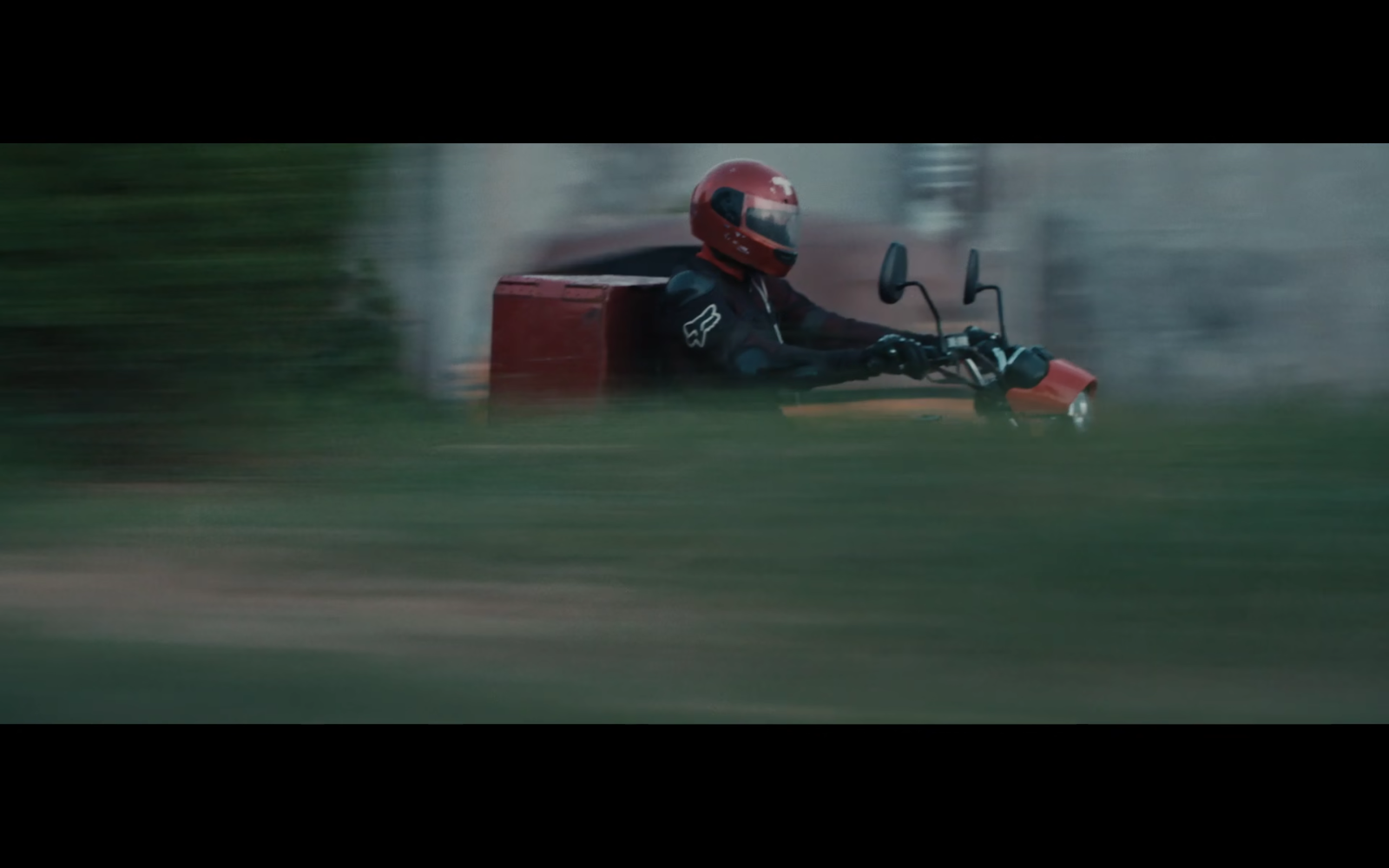
Nous voulions que le public ressente la folie de ce que c'est que de conduire une moto à grande vitesse à travers Lagos.

Et pour concrétiser ces intentions artistiques, quelle a été votre stratégie pour contrôler vos images dans la vie chaotique de Lagos ? 

Contrôler l'image représente toujours un vrai défi dans la réalisation de documentaires car on doit s'accommoder de la lumière disponible, dans la plupart des situations. 

Nous voulions un look à la fois âpre et poétique tout au long du film, et nous avons généralement essayé d'éviter la lumière de face. 

Mon approche était assez simple: chaque fois que cela était possible, nous avons tourné les plans extérieurs au crépuscule ou à l'aube. 

Pour les intérieurs, j'ai toujours essayé d'éteindre toutes les lumières et d'utiliser la lumière naturelle des fenêtres. Cela crée des contrastes étonnants et nous donnait toujours une belle image. 

Dans les situations où les fenêtres n'étaient pas une option, j'ai essayé d'éteindre les lumières au premier plan pour aider à créer des zones de lumière autour de nos personnages. Il s'agissait toujours de créer des zones contrastées d'obscurité et de lumière au sein d'une même image.

La palette de couleurs est inhabituelle et met des "rouges sang" au premier plan, mais de manière très subtile. Le rouge est normalement une couleur agressive, et le simple fait de la désaturer lui donne normalement un aspect marron. Il n'en est rien dans Blood Rider. Comment avez-vous contrôlé cela ?

La couleur rouge joue évidemment un rôle prépondérant dans ce film car c'est un symbole de la vie.

A un niveau plus simpliste, c'est aussi la couleur du sang. Nous avons eu la chance que les motards aient un uniforme rouge, et nous avons essayé de les garder dans cette tenue autant que possible. Cela a créé un contraste de couleur qui les a séparés des arrière-plans chaotiques de Lagos.

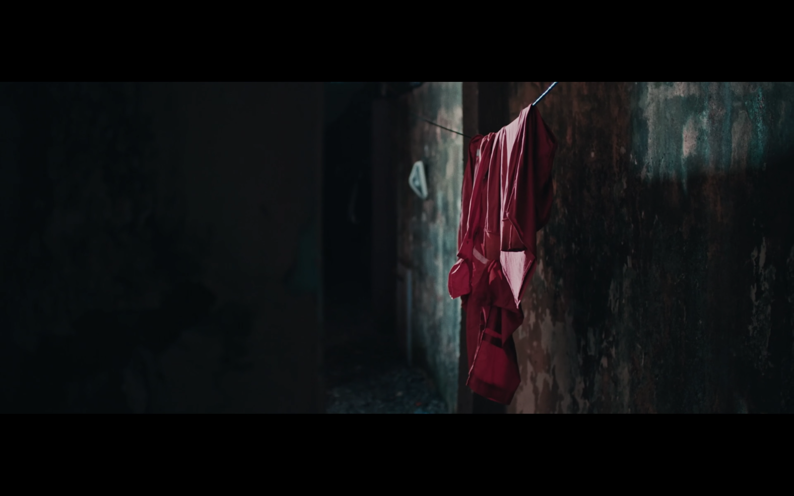
Pour aller avec notre look granuleux, nous avons légèrement désaturé le rouge en post, afin qu'il ne soit pas trop vibrant ou distrayant. Pour répondre honnêtement à la question, nous avons eu beaucoup de chance.

L'atmosphère granuleuse de la "partie Joseph" du film semble provenir de votre utilisation de la lumière disponible. Avez-vous ajouté des sources artificielles ou des lumières de jeu ? 

Dans la plupart des cas, j'essaie d'utiliser les lumières artificielles disponibles. Ma méthode est simple : éteindre toutes les lumières derrière la caméra et allumer toutes les lumières derrière les sujets. Cela permet de créer une lumière qui modèle bien les personnages. 

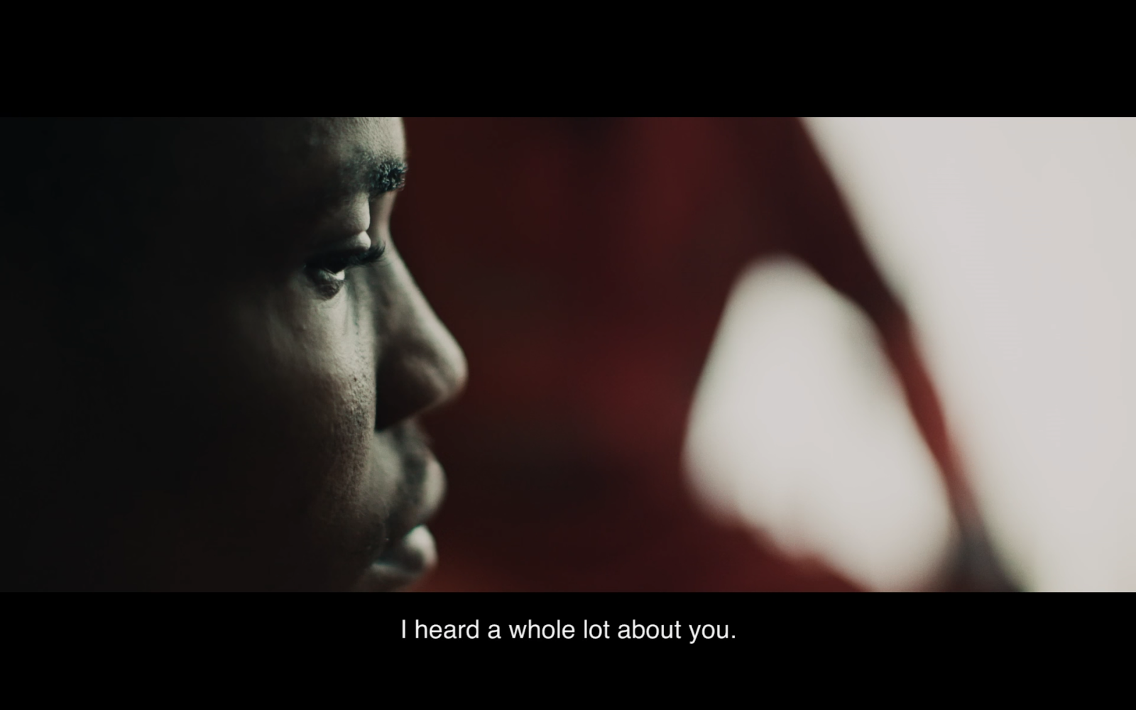
Dans ce lieu particulier, il n'y avait la plupart du temps que des plafonniers, ce qui n'était pas très joli. Comme simple kit d'éclairage, j'ai amené quelques LEDs Quasar, sur batteries, dans la plupart des endroits. Pour le plan ci-dessous, j'ai éteint toutes les lumières zénithales et j'ai placé un Quasar 60 cm dans le fond. Tu peux voir l'effet sur le visage de Joseph.


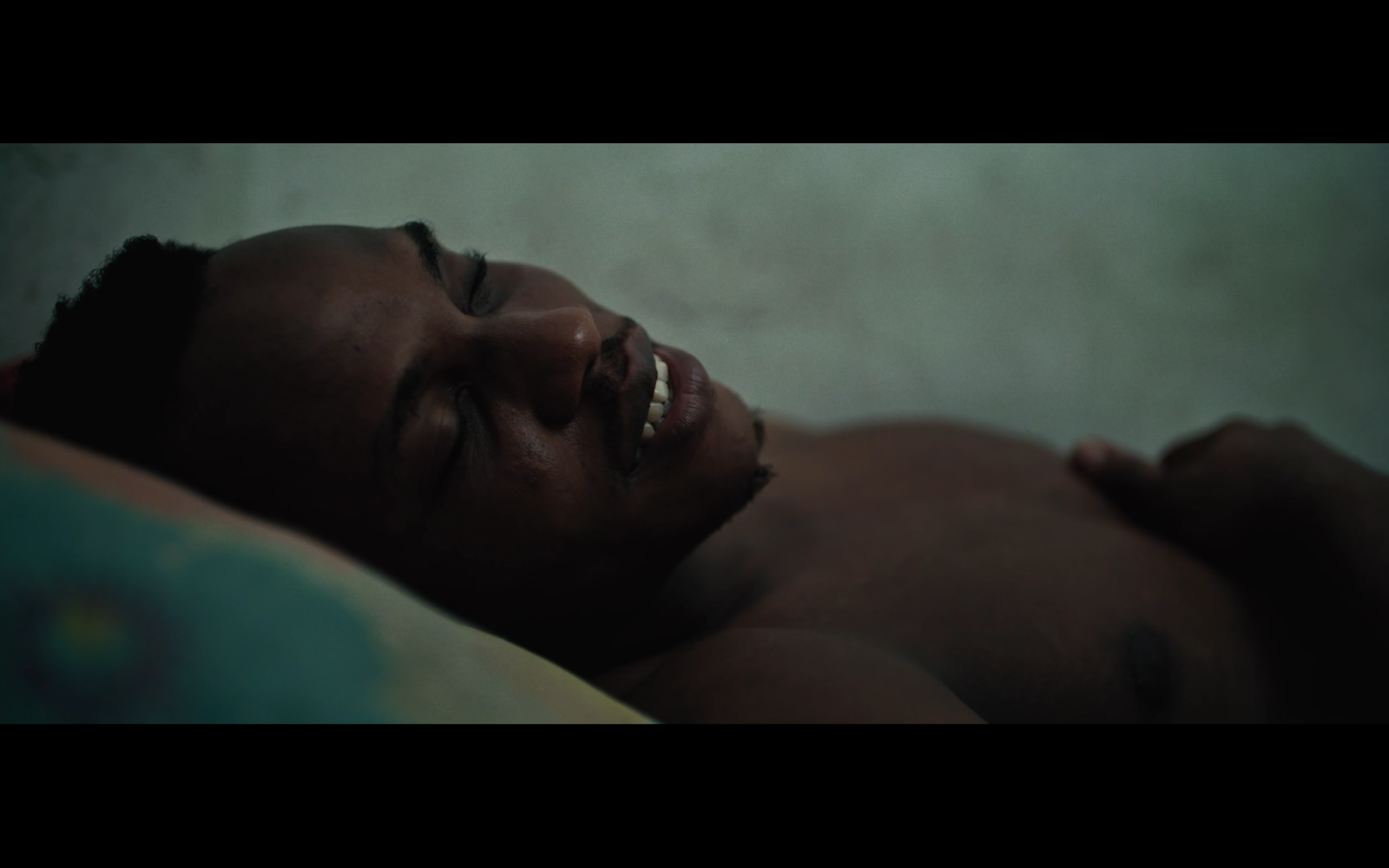
Vous avez surpris Joseph dans des endroits inhabituels pour son interview, allongé sur son lit par exemple. Dans un autre cas, deux personnes qui parlaient semblent avoir été placées très loin l'un de l'autre et à 90 % afin de créer des silhouettes et des flous, indépendamment de la cohérence spatiale. Cela semble très irréaliste et pourtant totalement convaincant.


Bien entendu, cela reflète les choix du réalisateur, mais comment avez-vous collaboré pour paraître aussi symbiotiques ? (Jon Kasbe, le réalisateur, semble également avoir un œil très sûr!)

Jon est un Réalisateur incroyable, et un Chef Opérateur vraiment fantastique aussi. Nous tournions avec deux caméras, chacun la sienne. À ce stade de notre collaboration, nous avons tourné des milliers d'heures ensemble, et nous pouvons communiquer avec de simples regards. 

Nous comprenons les mouvements de l'autre et pouvons généralement rester hors du champ de l'autre, tout en obtenant des images très intimistes. C'est une sensation incroyable quand j'ai l'idée de changer d'angle et que je réalise que Jon a déjà trouvé la position que je m'apprêtais à occuper! 

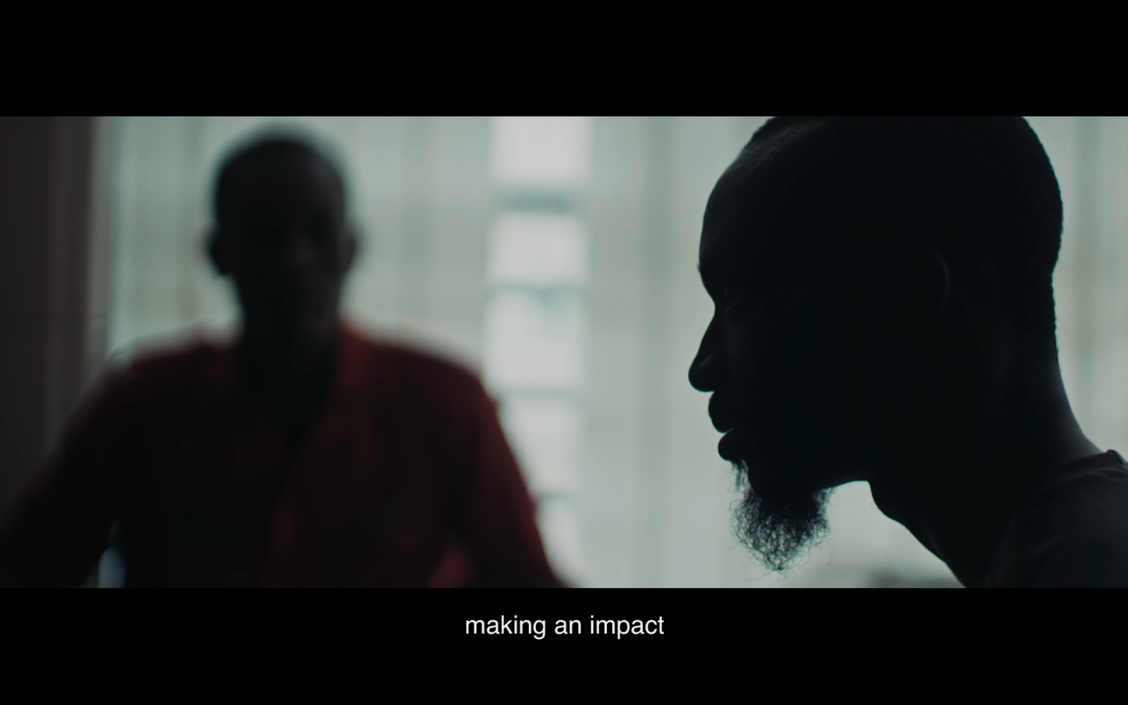
Nous sommes très synchrones sur le plan visuel. Cette scène était simple d'une certaine manière - nous avons éteint toutes les lumières, et utilisé les fenêtres derrière les personnages comme source principale - les profils étaient silhouettés, et les faces, soit dans la pénombre soit en latérales. 

C'est une scène dramatique, car les personnages discutent des enjeux du travail et des vies qui sont entre leurs mains. Il a semblé approprié de les laisser dans la pénombre alors qu'ils abordaient ces questions.


Une double question : dans quelle mesure connais-tu ce qu'il est possible de réaliser en matière d'étalonnage (recadrage compris), et de quelle manière cette compétence affecte-t-elle tes habitudes de tournage ? 

L'étalonnage est toujours très important pour moi en tant que Directeur de la Photographie, et j'expose généralement les images pour nous donner le plus de marge possible à l'étalonnage. 

Pour ce projet en particulier, nous avons tourné sur la Sony FS7 - c'est une petite caméra idéale pour un documentaire, puisqu'elle permet d'obtenir des images cinématographiques avec un corps léger et peu encombrant. 

Le seul problème, c'est qu'elle devient très bruyante quand on sous-expose, ou même quand on expose normalement. C'est pour cette raison que nous avons tout filmé en surexposant le plus possible, juste avant de clipper les hautes lumières. Cela nous a donné une image beaucoup plus nette, et davantage de latitude en colorimétrie. En post-production, nous avons tout assombri de manière significative, et désaturé les couleurs pour aboutir aux tonalités que vous voyez dans le film final.

Quel est ton plan préféré et pourquoi ?

C'est celui-ci :


Pour moi, c'était un moment magique. On voit le bébé clairement pour la toute première fois, et on ne sait pas s'il respire ou non. Puis, finalement, il commence à pleurer. C'est un profond soulagement car nous savons enfin que le bébé va bien, et que le travail du Blood Rider est terminé. 

Capturer des moments comme ceux-ci me donne l'impression d'avoir beaucoup de chance d'être cinéaste.

Quel matériel caméra / objectifs et éclairage as-tu utilisé ?

Caméra : Sony FS7 avec objectifs Canon série L (35mm, 50mm, 24-105mm)

L'éclairage : Kit Quasar sur batteries (2ft, 1ft, 6inch)

Une question plus générale : pourrais-tu nous montrer une photo que tu as affichée bien en évidence chez toi, qui t'inspire et te touche particulièrement, même de façon mystérieuse ? 

Et commente-la, si tu en as envie.
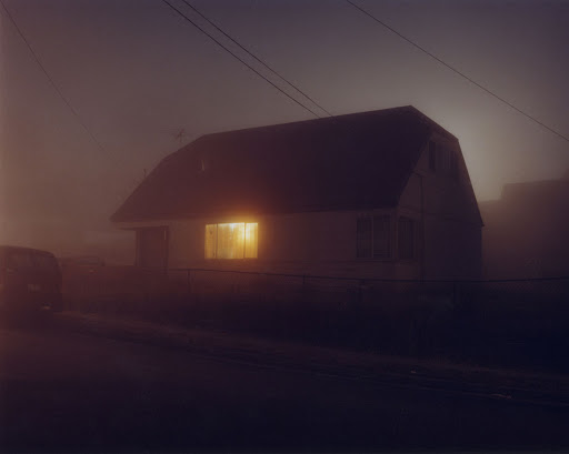
Je suis un grand fan de Todd Hido, en particulier de sa série "House Hunting". Je garde tous ses livres sur ma table basse, et ils me servent constamment d'inspiration et de référence. 

Cette image en particulier m'a toujours parlé. La pénombre, le brouillard et la lumière rougeoyante de l'intérieur me parlent beaucoup. 

Il y a tellement de mystère dans cette image que je me demande souvent ce qui se passe dans la maison. Certains jours, j'ai l'impression que c'est quelque chose de joyeux, tandis que d'autres jours, je sens quelque chose de tragique. 

Pour moi, une bonne image peut signifier beaucoup de choses différentes, selon le jour où tu la regardes.

« Blood Rider » - Natural Light at its Best

En bref  Version anglaise de l'interview avec David Bolen sur « Blood Rider ». Le film, primé à Camerimage, illustre ce que deux directeurs photo peuvent accomplir en tandem, en lumière naturelle, dans un environnement imprévisible. Les réponses de Bolen détaillent ses choix de terrain et sa relation avec le sujet.


"Blood Rider" is a short documentary directed by Jon Kasbe and DP'd by David Bolen. Their film won the mention at Camerimage as the best photographed short doc of the year.
David and Jon are both Cinematographers, and their tandem on this film is an example of what's possible to achieve, even in natural light and chaotic situations. David was kind enough to answer my questions. 

I recommend that you read his answers before playing the movie, at the end of this post.


If you had to summarize the look of this film, how would you describe it? 
In general, our goal with this film was to make it feel as intimate and realistic as possible. We primarily shot on a 35mm prime lens, which forced us to stay close to the action rather than relying on zoom lenses to get close. 
When we wanted a close-up of a character, we had to physically get close to them, and I think the audience can feel that intimacy in the visual style. 
We shot handheld for the entire film, and embraced the chaos and instability that came with that. 
We wanted the audience to feel the madness of what it’s like riding motorcycles at high speed through Lagos.

And in order to achieve this “mood board”, what was your strategy to control your pictures in the chaotic life of Lagos? 
Controlling the look is always really challenging in documentary filmmaking because you’re dealing with natural light and available in most situations. 
We wanted a moody and poetic look throughout, and typically tried to avoid front light. 
My approach was pretty simple. Whenever possible, we tried to shoot exterior shots at dusk or dawn. 
For interiors, I always tried to turn off all the lights, and use natural light from the windows. This creates amazing contrast and always looks beautiful. 
In situations where windows weren’t an option, I tried to turn off overhead lights in the foreground to help create pools of light around our characters. It’s always about trying to create contrasting areas of darkness and light within an image.


The color palette is unusual and puts “blood reds” in the foreground, but in a very subtle way. Red is normally an aggressive color, and simply desaturating it makes it look brown. How did you control that?
The color red obviously plays a huge role in this film as it’s a representation of life.
On a more simplistic level, it’s also the color of blood. We were lucky that the riders had red uniforms, and we tried to keep them in that outfit as much as possible. It created a great pop of color that separated them from the chaotic backgrounds of Lagos.
To go with our gritty look, we desaturated the red slightly in post, so that it didn’t feel too vibrant or distracting. To answer the question honestly, we got very lucky.


The gritty atmosphere of the “Joseph part” of the picture seems to come from your use of available light. Did you add “film sources” and/or practicals? 
For the most part, I try to use available practical lights. My approach is simple - turn off all the practicals behind the camera, and turn on all the practicals behind the subjects. This creates a beautiful rim light on the characters. 
This particular location mostly just had overhead lights, which didn’t look great. As a simple lighting kit, I brought a few batteries powered quasar LEDs to most locations. I turned off all the overheads, and placed a 2-foot quasar in the far background. You can see this adding some rim light to Joseph’s face.


You caught Joseph in unusual places for his interview, lying on his bed for example. On another occurrence, two people speaking seem to have been placed far apart and at 90% to provide silhouettes and blurs, regardless of spatial coherence. This seems highly unrealistic yet totally convincing.


Of course, it reflects the Director’s choices, but how did you collaborate to seem so symbiotic? (Jon Kasbe the Director seems to also have a very strong eye)
Jon is an incredible director, and a really fantastic cinematographer as well. We shoot two cameras, he operates one and I operate one. At this point, we’ve shot thousands of hours together, and can communicate with simple eye gestures. 

We understand each other's movements, and typically can stay out of each other’s shots while still getting very intimate images. It’s an amazing feeling when I have an idea to shift angles, and realize that Jon has already found the shot I was about to take. 

We are very in sync on a visual level. This scene was simple in a way - we turned off all the lights, and used the windows behind them as a key light - when shooting profiles, this put them in silhouette, and when shooting frontals, this gave them fantastic half-light. 

This is a dramatic scene, as the characters discuss the stakes of the job, and the lives that are at risk. It seemed suitable to play them in darkness as they reflect on this idea.

A double question: how far are you aware of what's possible in color grading (reframing included), and in what way does this knowledge affect your shooting habits? 

Color grading is always very important to me as a cinematographer, and I typically expose images to give us the most room to play around once we get into the grade. 

For this project specifically, we shot on the Sony FS7 - it’s a great little camera for a documentary, and allows you to get cinematic images with a small/lightweight body. 

The only issue is that it gets very noisy when you underexpose, or even normally expose. For this reason, we shot everything highly overexposed to where we were just under the point of clipping the highlights. This gave us a much cleaner image, and more latitude in the color grade. In post, we darkened everything significantly, and desaturated the colors to give it the atmospheric tones that you see in the final film.

What is your favorite shot and why?
Here’s my favorite shot:


To me, this was a magical moment. The baby is seen clearly for the very first time, and it’s unclear whether he’s breathing or not. Then, finally, he begins crying and there is a deep relief as we finally know the baby is okay, and the rider’s job is done. 

Capturing moments like these make me feel extremely lucky to be a cinematographer.

What Camera / Lenses & Lighting package did you use?

Camera: Sony FS7 w/ Canon L-Series Lenses (35mm, 50mm, 24-105mm)

Lighting: Battery-Powered Quasar Kit (2ft, 1ft, 6inch)

A more general question: could you show us a picture that you’ve displayed prominently in your home, that resonates a lot with you, even in mysterious ways? And comment on it, if you feel inclined to.


I’m a huge fan of Todd Hido, especially his House Hunting photo series. I keep all his books on my coffee table, and they constantly serve as a point of inspiration and reference. 
This image in particular has always spoken to me. The dim color, the fog, and the glowing light from the interior of the house are all quite meaningful. 
There’s so much mystery to the image - I often find myself wondering what’s happening inside. Some days I feel like it’s something joyful, while other days I feel there’s something tragic inside. 
To me, a beautiful image can mean many things depending on the day that you look at it.

Thanks for your time!


14 mai 2020

The Colors of Summer - HDR color grading for Netflix

En bref  Interview de Valerio Liberatore, étalonneur de la série Netflix « Summertime », tournée en HDR. Le passage du SDR au HDR bouleverse l'étalonnage : les couleurs saturées de l'été italien imposent des choix que la dynamique étendue rend plus complexes. Un cas concret de la manière dont la technologie HDR modifie le rapport entre le plateau et la post-production.
La version française de ce post paraîtra dans quelques jours.
Je poste la version originale pour faciliter l'accès à ces informations au lectorat anglophone. 
Découvrez la série sur Netflix en attendant ;-)


An interview with Valerio Liberatore, Colorist


I've just discovered SUMMERTIME, an Italian romantic comedy available as a series on Netflix.
Sure enough, this show is catchy. Because it's nicely written, well-performed, and very well directed.

But what caught my attention was the use of a very controlled color palette. The RGB LED sources nowadays allow easy access to a wide range of colors, and some people overuse them. You know, screaming colors, contrasts that rip your retinas, overdoses of flashy funkiness... Nothing like that here.

Although the work of the cinematographer Federico Schlatter (his IMDB page, Instagram) is noticeable - I write that because it was once believed that the cinematography, like the soundtrack, should never bring attention to themselves - it always supports the story, and especially the changing moods of the protagonists.
And also, it's gorgeous.

I immediately sensed an excellent collaboration between a cinematographer and his colorist. So I contacted Valerio Liberatore, the Color Grading Artist of this Netflix series, to ask him some rather precise questions about his work.

He was kind enough to provide us with detailed explanations, which blend technology and art harmoniously. 
Netflix proposes an HDR and SDR version of the series, which I didn't know when I discovered the show in Standard. 

Since High Dynamic Range is an emerging format, this interview was also a great opportunity to consider its practical implications from shooting to end delivery, from a Colorist point of view.


How would you describe the visual style of the Series? Did you have specific references?

First of all, I want to thank you Pascal for reaching me out for this interview. It was totally unexpected... as a young colorist, this is the first interview of my life, so I hope I will do fine!

I would define SUMMERTIME as an explosion of colors. We aimed at creating a fantastic world, really characterized by strong saturations and many color contrasts. Everything seasoned with a diversity of looks based on the emotions and the situation, which would feel extremely different, but part of the same universe.


Do you have a color palette you could share with us?


Yes we did, and here it is:


This palette represents just part of the explosion of colors that Summertime has to offer. We wanted to use those really warm tones, surrounded by these different cold ones that would result in a joyful color contrast. 

Lighting, costumes, and scenography played a crucial role. They were using and respecting those palettes already, so having all these colors to work with during the final grade was a pleasure for me. It made us concentrate more on how to enhance what we already had from the set, which is more of a creative approach, rather than a corrective one. 

Those different saturations were playing together and separating themselves from the other, resulting in this gorgeous universe of hues that were surrounding this fantastic world that Federico wanted to create.

Regarding the visual style, let's take an example: What about the choice to overexpose windows and to use heavy glow? Was it planned from the beginning?


So, first of all, keep in mind that the main delivery was HDR. In a much wider dynamic range, windows and brighter regions were much more present.

With that said, yeah, the windows were much brighter and overexposed compared to the indoors. Since the beginning, the main delivery would have been SDR, it's a stylistic choice. Federico wanted to recreate this fantastic world, and those overexposed windows with that glow always present was for sure, playing a big role in that context.

This was achieved in two ways, one on set through exposure and the use of the Black Pearl ⅛ filters, that were softening a lot some textures and the highlight itself. Last but not least, in post, of course, by me. What I love about grading its not only the capabilities you have to manipulate and shape the colors. What I also love to do is to control textures.

Which could be related. To make an example, let's take the micro-contrast control in a certain parts of the signal or the frequencies. Study on the grain (which was not used in that case), softening in some cases the incision of the lenses or vice versa, augmenting the incision of softened images. In that case instead, what was really present was enhancing the initial thought of Federico on how the highlights should have behaved. Which was augmenting those glowing in the scenes, and in some of them, even recreate an halation emulation (more on this later).


About your respective roles, between the DoP and you: What had to be done on the set, and what was your specific part in post? I mean, how was the Look and Feel balanced between you and the DoP (and of course Art Director and Wardrobe)?


We were pretty much on the same wavelength. There was a thought since the beginning. A thought that we tried to develop all together and bring it through the whole chain, until the end. I am really grateful that I was able to grade this show and collaborate with Federico was awesome!

Federico, if you are reading this, I thank you so much for the freedom and the trust you gave me. For me it was a wonderful and enlightening journey. I learned so much from you! There was this continuous exchange of information between us during the shooting phase. I was going on set, looking at the scene with my eyes and seeing what the thought behind it was. Speak with Federico, try to catch that was in his mind and go back to the dailies lab and recreate it. Send him out some stills or cuts that were helping him visualize a much more advanced version of it. Which is always helpful. :)

We had the incredible support of the production, Cattleya, that was trusting us totally. This was crucial for us. We were able to focus on the creative and technical aspects of the show...

We basically had this idea in mind, and we pursued it as we wanted, supported by everyone.


How did you receive visual information about the grading options ?


Federico attended basically the whole grading phase, which for me was really important because I had real-time feedbacks, which speeded up the really short amount of time we had for grading each episode...which was 2 and a half days per episode. During the grading phase, then there wasn't the necessity of sharing content between us.

It had been done during the dailies phase, with the sharing channels provided by Netflix. All rushes were available to be seen for: Netflix, the production, directors, Federico and the grading facility to have a sort of real-time feedback between all the departments on a daily basis. 

As a plus, I was on set during the dailies phase. During that time, Federico, Marco (the DIT), and I were meeting after hours to check the footage and already think about what we would have wanted to reach in the grading suite. Making me carrying on and advance a little bit more with the color on set already - due to the lack of time after.


How did you interact with Marco Coradin, the DIT ? 


We were keeping in touch a lot and seeing each other at the end of each shooting day to make a point of the situation. Even when I went back to Rome, we still were in contact.

Since the beginning, there was this technical exchange between us two that made us think about how to structure the entire pipeline to make it suitable for our needs. 

Marco is really knowledgeable, so we found ourselves, nerdy mates, discussing each day on what we could have done better to improve the workflow. We were exchanging a lot of stills and ideas. Discussing the look. He was also coming to the dailies lab, I was going to visit him on set. There was this constant constructive exchange.

He's such a talented guy, I really like working with him... to the point that we even opened up Mint, a company which encapsulates many gifted people inside with the main purpose of granting top-level grading, look development and on set services. 


Federico Schlatter, the show's DoP, is making a cameo on the left :)

About hardware and software:


What was the camera? Sony Venice
The lenses? Cooke S7
Any filters used on set? Black Pearl 1/8
The file format? XOCN-ST
The grading software? DaVinci Resolve 16


What about the SDR and HDR Masters? 


The HDR was actually the Master and main delivery. The SDR was done through the Dolby Vision Content Mapping Tool they require to be used for Netflix deliveries. To that, a few tweaks to the grading were done to match the two different deliveries perceptually as much as possible.

"There is a day-for-night that I did in grading only."

Did you use any LUTs? How many? Purely technical LUTs or also artistic ones?


This topic, I think, needs a little bit of an introduction, even because there's a small anecdote that I wanna share with you. 

We worked in ACES. We structured and color managed the whole pipeline using the Academy Color Encoding System, which is becoming a more current standard in motion picture and tv production. It's a global standard for interchanging digital image files, managing color workflows, and create masters for delivery and archiving. 

What was the purpose of this in our case? It maintains color fidelity from the beginning to the end of the chain. This means that what was thought on set, the DP would have seen it in the grading suite.. and works like a charm with the Sony Venice! 

In the beginning, the show was only SDR in terms of delivery. During our grading sessions, we closed the first two episodes, and we were proceeding with the third episode. Illuminating news (in every way) popped up. There was the possibility to grade and deliver the entire Series in HDR.

What were we doing then with the first two episodes that were already graded? Just switch the output transform to the new desired standard, and ACES was taking care in making all the technical transforms needed to maintain color consistency and have a strong uniformity in color perceptions in such a huge gap between the two. 
The only thing I had to take care of and modify it was reducing some saturation from some changes I was doing in SDR on skies, for instance, where it wasn't required with the same intensity.

I guess I am overspeaking, I was trying to make it brief, but it was so much stuff to say :)

To answer your question now, the purely technical side of the color management was done through the project settings and ACES itself. 

At the same time, we had only one creative/artistic LMT (Look Modification Transform), which was empirical and contained a LUT. It was really behaving well for what we wanted to achieve: Punchy and robust contrast, warm and rich skin tones seasoned with strong color separation, both achieved with the look development phase by making the LUT, and during the grading itself to extract the essence of those colors that the sensor was able to capture. 


How do you start your grading sessions, let's say on a new scene?


I have my whole node tree set up in each shot already, which helps me speed up my grading workflow. I usually start from a master shot that will set up the look for everything else, like close-ups. 
Focus at first on reaching an overall contrast and look I am happy with on that master shot, just using primaries, proceed then with the secondaries. 
Masking and then at last work on texture. Which I just set up with the client but then complete on my own, because it's really time-consuming and I wanna focus on the grading when I have the chance to sit close to such a talented DP! :)


Could you share a trick you often use, something you particularly like to do (and maybe no one sees but makes you happy)?


Sometimes I really love to create a halation emulation in my shots. It probably gets unnoticed by the majority of the eyes. This effect occurred only with film, not with digital. So it's basically that you could only try to reproduce in post, on something shot digitally.

It was happening when the light was so strong that it was maxing out the capabilities of absorption of certain areas, resulting in the majority of the cases in this reddish glow around white and overexposed areas of the film.

It's done basically combining different highlights qualifying, edge detection to specifically control the edges of those parts, converting them in a grayscale image, and using it as an alpha channel attached to a node that eventually gets blurred out and colored to simulate that effect. That's the simplest part of it but already gives you 70% of the impact.

This is combined with a much more complex highlight isolation, done working in linear gamma that helps you define it much more in details. 
It requires times, that is why I do it on the masters shot mainly with the DP, to see if he/she likes the effect, and then proceed on fine-tuning it by myself.


This is one shot with the recreated halation. I didn't want to be too strong overall in the Series. Considering the high level of saturation already there, I wanted it to be there, but subtle and unnoticed. I didn't want to point the attention there.


And now let's take a Case Study: One Specific Grading Moment.
In S1E5 around 34 minutes, this rosy daylight scene is both very pleasing and very bold.
Could you explain how the DoP and you came to this decision?


Perfect! I am glad you brought that out! So, let's start from the point that that scene was shot in the afternoon and had a pretty neutral look at the beginning. 

That part of the episode was taking place in a late afternoon, almost evening vibe. We characterized those kinds of scenes with this rose look in the whole show. To us, it was giving something magical and unique. Discussing it with Federico, we ended up deciding to not break the flow, of course, that is one of the fundamentals of color grading :)

But doing that wasn't that straightforward. We wanted to also reach a look that we would have liked, not just something that would have fit there. So, after a few tests, we decided to proceed in a way that was chronologically and dynamically changing from the beginning of this really long sunset. To achieve the rose look we liked on that particular scene, we went back and made the viewer adapt to that before reaching it. Taking advantage of something we have biologically happening in our retina and our brain, called chromatic adaptation. 

It all started 5 minutes earlier in the episode, but you won't notice. There's a dynamic layer that's bringing you there. So when you reach that scene, yeah its really pink, but it won't feel outside of the context or strange. I challenge you to go and check it right now, with fresh eyes ;)

Was this shot the beginning of the "Pink Road"?
 

No, even before. At 29:40 already, it's starting to get present there the rosy grade. Sooooo subtle but it's beginning there:


But there is also another case that is based on that concept. Episode 4, from 20 minutes on, it's just an infinitely long sunset, which goes from warmish orange to the usual pink.

And that's all dynamic, progressive:


And to end with a bang: what is your favorite shot?


If I have to choose a shot, I would say this one below. 
I loved how we ended up creating this world at the boundaries of the gamut. :)


And if I had to pick a whole scene, the ending sequence of episode 03, the one closing up with the Ferris wheel. From 27 minutes on. My favorite so far!


Did you see Euphoria, the HBO series? I think you would love the use of colors, depth of field and contrasts!


I have seen the Series 2 times! I loved it!!

Thanks a lot for your time, Valerio.


Marco Coradin's Instagram: https://www.instagram.com/marco_coradin/


10 juin 2011

The Borgias - les lumières de la Renaissance

En bref  « The Borgias » de Neil Jordan, photographié par David Tattersall, offre un traitement chromatique raffiné — pas une reconstitution muséale, mais une palette vivante et émotionnelle. Le costume, le décor, la lumière convergent vers une même ambition : rendre la Renaissance charnelle et politique, pas décorative.


La première saison de The Borgias (Neil Jordan pour Showtime) vient de se terminer.
Signées par le Canadien Paul Sarossy, les images sont directement inspirées de certains tableaux de la Renaissance. L'histoire racontée inspire à Sarossy des ambiances "chiaroscuro" plutôt radicales, mais aussi des compositions toutes en pénombres, moins fortement contrastées.
C'est un vrai festin pour les yeux. J'ai retenu 46 images pour vous donner un aperçu.

Une interview intéressante de Sarossy vient de paraître sur le site de la Canadian Society of Cinematographers. J'en ai tiré un large extrait:

Eclairage à la bougie ou électrique?

"One decision Sarossy had to make was whether to shoot with real or simulated candlelight. The Italian Renaissance left so much art in its wake that the look of that art has come to represent the look of the times. It has a certain warm, dark glow to it. Sarossy had to figure out if this was indeed how the times appeared to the artists of those paintings, or is it the effect of passing centuries, or is it something else? “In those days those references were brand new, probably very colourful and bright. A famous example was the Sistine Chapel, which was restored a few years ago. Much to everyone’s surprise, it was not a monochrome and muddy looking thing. It was colourful and bright. Presumably that's what it looked like when it was new."

“This particular story and its place in the world has so much visual reference attached to it – frescoes and paintings – it is the forefront of the world of Western visual art. When we decided to shoot one scene in candlelight, I made a discovery. I thought there was some horrible problem, as the scene was getting darker and darker and I couldn’t understand what was happening. Now I get why so few films are not shot in real candlelight. We had 100 candles, and that created a huge amount of black smoke, to the point where the air was so polluted I couldn’t see through it. I guess that’s the reality of that world of candlelight, and there was a lot of smoke in the air. After a few centuries the paintings would have darkened and lost colour. With real candles the smoke is black. With movie smoke, it’s white and that’s good for seeing. That was very interesting.”

Sarossy and the rest of the creative team decided the best way to go was halfway between the world of smoke-affected canvasses and the brightness of what those objects and people must have looked like when they were fresh. “This was definitely a learning curve. The conundrum was: Do I make things look old, because that’s what the audience is expecting, or do I make it look new like it was at the time, but the audience is not used to? In the first few days of work, everything was shot clean but it didn’t look correct. Then it was decided to strike a happy balance. Things may have been relatively new at that point, but Rome is an ancient city. The clothes and ornaments would have been brand new, and those were shot as new, but the walls and windows had centuries of grime. We decided to use some artistic license to make it seem more realistic, and I guess dirty looks more real.”

Choix de la caméra

The choice of camera was determined by the fact that the production would be shot digitally. “The camera came from Munich, the best HD available at the time. Cameras are changing every six months. Whatever camera was the cat’s meow last year is on the junk heap this year. When cameras became digital they became computers with lenses on them, and computers have a very short life span. Everything is changing, upgrading and whatnot. It used to be that you had a camera for decades, but now cameras have become disposable. They have become the new film stock.”

Just for the record, the camera was the Sony F35, “which is very similar to the Panavision Genesis.” It doesn’t seem to make much difference to Sarossy anyway. “I have never been very techno oriented. I am much more intrigued with the story and the way the camera does and doesn’t see things; the way the story is supported by the camera. It doesn’t matter what the camera is, as long as it works.

Deux réalisateurs, deux méthodes de travail

With The Borgias, Sarossy had a chance to work with Neil Jordan, writer, director and Oscar nominee for best director for The Crying Game, and Jeremy Irons, an established A-list star, multiple Oscar nominee and winner for best actor in Reversal of Fortune. What was Sarossy’s experience with Neil Jordan? “It was definitely a great education. What was incredible was his ability at the last minute to figure things out. He’d arrive on set with no pre-conceived notions. He never let pre-formed ideas interfere with how a scene would evolve in front of him. He’d watch the actors play the scene a few times. He’d walk around them with the viewfinder and determine the best place to see the scene play out. He’d ask the operator (Mark Willis) and me what our thoughts were. Very quickly he figured out what was important to see and always allowed the camera to tell the story, in the most efficient yet clever way. We finished everyday with what I felt were some of the best shots I’d ever done. It was kind of mysterious but wonderful.”

Canadian Jeremy Podeswa has been a popular director on high-end American television cable series such as Boardwalk Empire, True Blood and The Pacific. He was one of the four alternate directors on The Borgias. “Jeremy is very organized and prepared. He is a very different kind of director than Neil. Neil Jordan shoots very few shots, but each one is fully committed to moving the story forward, nothing is superfluous. On the other hand, Jeremy is a director who uses coverage where he shoots a lot of the same material over and over. That allows the actors to try many different things, which gives him a wide choice of performances, but the camera moves very little.”

Jeremy Irons

But what about Jeremy Irons, the A-list actor? “As much as he is a star in the American sense, he has the work habits of a European actor. In Europe, an actor feels that they are a part of the crew and are both technicians and artists. ‘Should I stand here first? Should I walk forward? How can I help you tell the story? This is what I plan to do.’ He’s very aware that, what helps the camera helps him, so he’s just wonderful to work with.”


Interview de Paul Sarossy datant de 2004. Il avait déjà éclairé pas mal de films d'Atom Egoyan, dont le très beau "Felicia's Journey".