En bref
Interview de Valerio Liberatore, étalonneur de la série Netflix « Summertime », tournée en HDR. Le passage du SDR au HDR bouleverse l'étalonnage : les couleurs saturées de l'été italien imposent des choix que la dynamique étendue rend plus complexes. Un cas concret de la manière dont la technologie HDR modifie le rapport entre le plateau et la post-production.
La version française de ce post paraîtra dans quelques jours.
Je poste la version originale pour faciliter l'accès à ces informations au lectorat anglophone.
Je poste la version originale pour faciliter l'accès à ces informations au lectorat anglophone.
Découvrez la série sur Netflix en attendant ;-)

An interview with Valerio Liberatore, Colorist
Sure enough, this show is catchy. Because it's nicely written, well-performed, and very well directed.
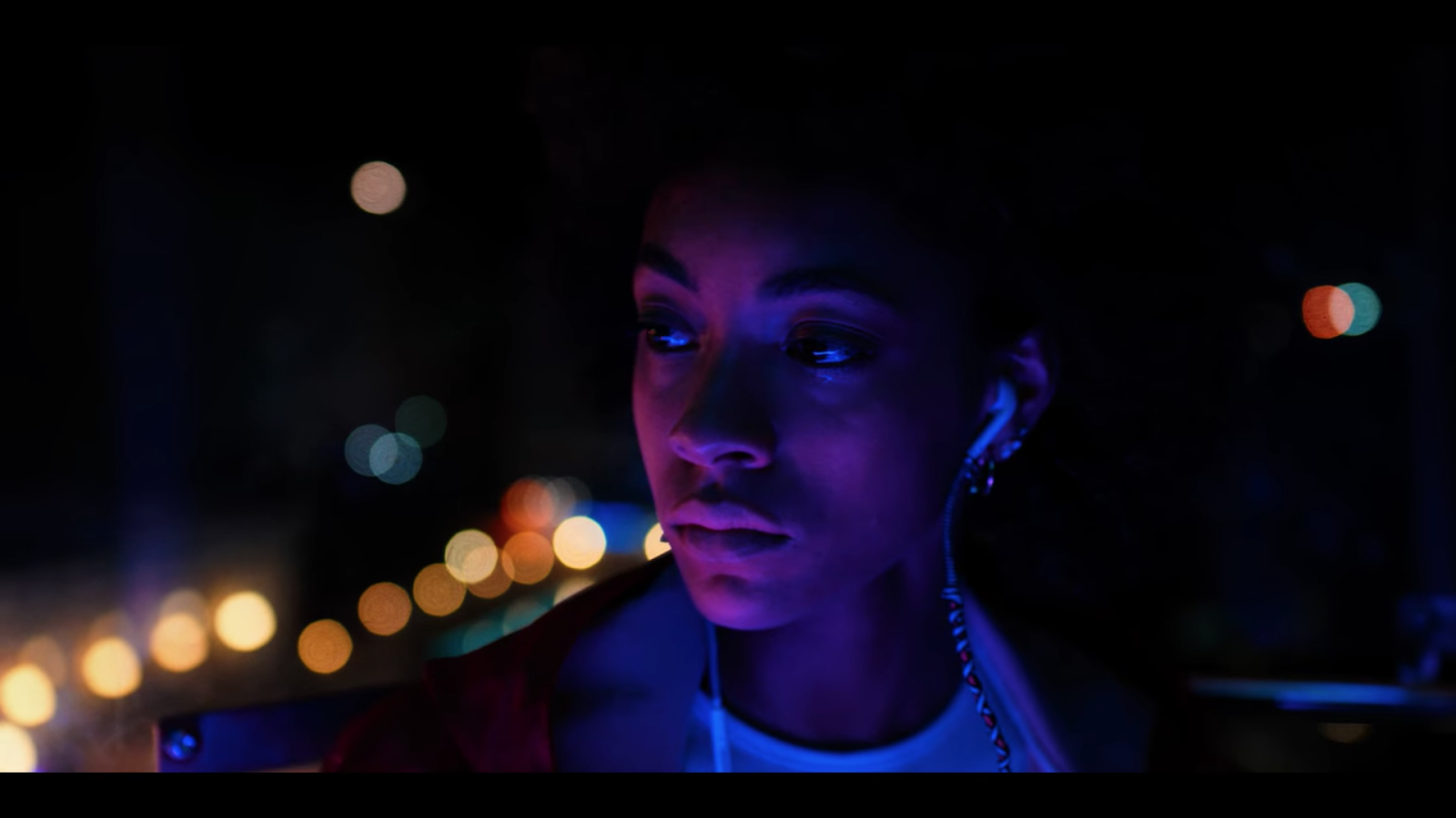
But what caught my attention was the use of a very controlled color palette. The RGB LED sources nowadays allow easy access to a wide range of colors, and some people overuse them. You know, screaming colors, contrasts that rip your retinas, overdoses of flashy funkiness... Nothing like that here.
Although the work of the cinematographer Federico Schlatter (his IMDB page, Instagram) is noticeable - I write that because it was once believed that the cinematography, like the soundtrack, should never bring attention to themselves - it always supports the story, and especially the changing moods of the protagonists.
And also, it's gorgeous.
I immediately sensed an excellent collaboration between a cinematographer and his colorist. So I contacted Valerio Liberatore, the Color Grading Artist of this Netflix series, to ask him some rather precise questions about his work.
He was kind enough to provide us with detailed explanations, which blend technology and art harmoniously.
Netflix proposes an HDR and SDR version of the series, which I didn't know when I discovered the show in Standard.
Since High Dynamic Range is an emerging format, this interview was also a great opportunity to consider its practical implications from shooting to end delivery, from a Colorist point of view.

How would you describe the visual style of the Series? Did you have specific references?

How would you describe the visual style of the Series? Did you have specific references?
First of all, I want to thank you Pascal for reaching me out for this interview. It was totally unexpected... as a young colorist, this is the first interview of my life, so I hope I will do fine!
I would define SUMMERTIME as an explosion of colors. We aimed at creating a fantastic world, really characterized by strong saturations and many color contrasts. Everything seasoned with a diversity of looks based on the emotions and the situation, which would feel extremely different, but part of the same universe.
Do you have a color palette you could share with us?
Yes we did, and here it is:

This palette represents just part of the explosion of colors that Summertime has to offer. We wanted to use those really warm tones, surrounded by these different cold ones that would result in a joyful color contrast.
Lighting, costumes, and scenography played a crucial role. They were using and respecting those palettes already, so having all these colors to work with during the final grade was a pleasure for me. It made us concentrate more on how to enhance what we already had from the set, which is more of a creative approach, rather than a corrective one.
Those different saturations were playing together and separating themselves from the other, resulting in this gorgeous universe of hues that were surrounding this fantastic world that Federico wanted to create.
Regarding the visual style, let's take an example: What about the choice to overexpose windows and to use heavy glow? Was it planned from the beginning?

So, first of all, keep in mind that the main delivery was HDR. In a much wider dynamic range, windows and brighter regions were much more present.
With that said, yeah, the windows were much brighter and overexposed compared to the indoors. Since the beginning, the main delivery would have been SDR, it's a stylistic choice. Federico wanted to recreate this fantastic world, and those overexposed windows with that glow always present was for sure, playing a big role in that context.
This was achieved in two ways, one on set through exposure and the use of the Black Pearl ⅛ filters, that were softening a lot some textures and the highlight itself. Last but not least, in post, of course, by me. What I love about grading its not only the capabilities you have to manipulate and shape the colors. What I also love to do is to control textures.
About your respective roles, between the DoP and you: What had to be done on the set, and what was your specific part in post? I mean, how was the Look and Feel balanced between you and the DoP (and of course Art Director and Wardrobe)?
We were pretty much on the same wavelength. There was a thought since the beginning. A thought that we tried to develop all together and bring it through the whole chain, until the end. I am really grateful that I was able to grade this show and collaborate with Federico was awesome!
Federico, if you are reading this, I thank you so much for the freedom and the trust you gave me. For me it was a wonderful and enlightening journey. I learned so much from you! There was this continuous exchange of information between us during the shooting phase. I was going on set, looking at the scene with my eyes and seeing what the thought behind it was. Speak with Federico, try to catch that was in his mind and go back to the dailies lab and recreate it. Send him out some stills or cuts that were helping him visualize a much more advanced version of it. Which is always helpful. :)
We had the incredible support of the production, Cattleya, that was trusting us totally. This was crucial for us. We were able to focus on the creative and technical aspects of the show...
We basically had this idea in mind, and we pursued it as we wanted, supported by everyone.

How did you receive visual information about the grading options ?
Federico attended basically the whole grading phase, which for me was really important because I had real-time feedbacks, which speeded up the really short amount of time we had for grading each episode...which was 2 and a half days per episode. During the grading phase, then there wasn't the necessity of sharing content between us.
It had been done during the dailies phase, with the sharing channels provided by Netflix. All rushes were available to be seen for: Netflix, the production, directors, Federico and the grading facility to have a sort of real-time feedback between all the departments on a daily basis.
As a plus, I was on set during the dailies phase. During that time, Federico, Marco (the DIT), and I were meeting after hours to check the footage and already think about what we would have wanted to reach in the grading suite. Making me carrying on and advance a little bit more with the color on set already - due to the lack of time after.

How did you interact with Marco Coradin, the DIT ?
We were keeping in touch a lot and seeing each other at the end of each shooting day to make a point of the situation. Even when I went back to Rome, we still were in contact.
Since the beginning, there was this technical exchange between us two that made us think about how to structure the entire pipeline to make it suitable for our needs.
Marco is really knowledgeable, so we found ourselves, nerdy mates, discussing each day on what we could have done better to improve the workflow. We were exchanging a lot of stills and ideas. Discussing the look. He was also coming to the dailies lab, I was going to visit him on set. There was this constant constructive exchange.
He's such a talented guy, I really like working with him... to the point that we even opened up Mint, a company which encapsulates many gifted people inside with the main purpose of granting top-level grading, look development and on set services.
He's such a talented guy, I really like working with him... to the point that we even opened up Mint, a company which encapsulates many gifted people inside with the main purpose of granting top-level grading, look development and on set services.
 |
| Federico Schlatter, the show's DoP, is making a cameo on the left :) |
About hardware and software:
What was the camera? Sony Venice
The lenses? Cooke S7
Any filters used on set? Black Pearl 1/8
The file format? XOCN-ST
The grading software? DaVinci Resolve 16
The HDR was actually the Master and main delivery. The SDR was done through the Dolby Vision Content Mapping Tool they require to be used for Netflix deliveries. To that, a few tweaks to the grading were done to match the two different deliveries perceptually as much as possible.
The lenses? Cooke S7
Any filters used on set? Black Pearl 1/8
The file format? XOCN-ST
The grading software? DaVinci Resolve 16
What about the SDR and HDR Masters?
The HDR was actually the Master and main delivery. The SDR was done through the Dolby Vision Content Mapping Tool they require to be used for Netflix deliveries. To that, a few tweaks to the grading were done to match the two different deliveries perceptually as much as possible.
 |
| "There is a day-for-night that I did in grading only." |
Did you use any LUTs? How many? Purely technical LUTs or also artistic ones?
This topic, I think, needs a little bit of an introduction, even because there's a small anecdote that I wanna share with you.
We worked in ACES. We structured and color managed the whole pipeline using the Academy Color Encoding System, which is becoming a more current standard in motion picture and tv production. It's a global standard for interchanging digital image files, managing color workflows, and create masters for delivery and archiving.
What was the purpose of this in our case? It maintains color fidelity from the beginning to the end of the chain. This means that what was thought on set, the DP would have seen it in the grading suite.. and works like a charm with the Sony Venice!
In the beginning, the show was only SDR in terms of delivery. During our grading sessions, we closed the first two episodes, and we were proceeding with the third episode. Illuminating news (in every way) popped up. There was the possibility to grade and deliver the entire Series in HDR.
What were we doing then with the first two episodes that were already graded? Just switch the output transform to the new desired standard, and ACES was taking care in making all the technical transforms needed to maintain color consistency and have a strong uniformity in color perceptions in such a huge gap between the two.
What were we doing then with the first two episodes that were already graded? Just switch the output transform to the new desired standard, and ACES was taking care in making all the technical transforms needed to maintain color consistency and have a strong uniformity in color perceptions in such a huge gap between the two.
The only thing I had to take care of and modify it was reducing some saturation from some changes I was doing in SDR on skies, for instance, where it wasn't required with the same intensity.
I guess I am overspeaking, I was trying to make it brief, but it was so much stuff to say :)
To answer your question now, the purely technical side of the color management was done through the project settings and ACES itself.
I guess I am overspeaking, I was trying to make it brief, but it was so much stuff to say :)
To answer your question now, the purely technical side of the color management was done through the project settings and ACES itself.
At the same time, we had only one creative/artistic LMT (Look Modification Transform), which was empirical and contained a LUT. It was really behaving well for what we wanted to achieve: Punchy and robust contrast, warm and rich skin tones seasoned with strong color separation, both achieved with the look development phase by making the LUT, and during the grading itself to extract the essence of those colors that the sensor was able to capture.
How do you start your grading sessions, let's say on a new scene?
I have my whole node tree set up in each shot already, which helps me speed up my grading workflow. I usually start from a master shot that will set up the look for everything else, like close-ups.
Focus at first on reaching an overall contrast and look I am happy with on that master shot, just using primaries, proceed then with the secondaries.
Masking and then at last work on texture. Which I just set up with the client but then complete on my own, because it's really time-consuming and I wanna focus on the grading when I have the chance to sit close to such a talented DP! :)
Sometimes I really love to create a halation emulation in my shots. It probably gets unnoticed by the majority of the eyes. This effect occurred only with film, not with digital. So it's basically that you could only try to reproduce in post, on something shot digitally.
It was happening when the light was so strong that it was maxing out the capabilities of absorption of certain areas, resulting in the majority of the cases in this reddish glow around white and overexposed areas of the film.
It's done basically combining different highlights qualifying, edge detection to specifically control the edges of those parts, converting them in a grayscale image, and using it as an alpha channel attached to a node that eventually gets blurred out and colored to simulate that effect. That's the simplest part of it but already gives you 70% of the impact.
This is combined with a much more complex highlight isolation, done working in linear gamma that helps you define it much more in details.
Could you share a trick you often use, something you particularly like to do (and maybe no one sees but makes you happy)?
Sometimes I really love to create a halation emulation in my shots. It probably gets unnoticed by the majority of the eyes. This effect occurred only with film, not with digital. So it's basically that you could only try to reproduce in post, on something shot digitally.
It was happening when the light was so strong that it was maxing out the capabilities of absorption of certain areas, resulting in the majority of the cases in this reddish glow around white and overexposed areas of the film.
It's done basically combining different highlights qualifying, edge detection to specifically control the edges of those parts, converting them in a grayscale image, and using it as an alpha channel attached to a node that eventually gets blurred out and colored to simulate that effect. That's the simplest part of it but already gives you 70% of the impact.
This is combined with a much more complex highlight isolation, done working in linear gamma that helps you define it much more in details.
It requires times, that is why I do it on the masters shot mainly with the DP, to see if he/she likes the effect, and then proceed on fine-tuning it by myself.

And now let's take a Case Study: One Specific Grading Moment.
In S1E5 around 34 minutes, this rosy daylight scene is both very pleasing and very bold.
Could you explain how the DoP and you came to this decision?

Perfect! I am glad you brought that out! So, let's start from the point that that scene was shot in the afternoon and had a pretty neutral look at the beginning.
That part of the episode was taking place in a late afternoon, almost evening vibe. We characterized those kinds of scenes with this rose look in the whole show. To us, it was giving something magical and unique. Discussing it with Federico, we ended up deciding to not break the flow, of course, that is one of the fundamentals of color grading :)
But doing that wasn't that straightforward. We wanted to also reach a look that we would have liked, not just something that would have fit there. So, after a few tests, we decided to proceed in a way that was chronologically and dynamically changing from the beginning of this really long sunset. To achieve the rose look we liked on that particular scene, we went back and made the viewer adapt to that before reaching it. Taking advantage of something we have biologically happening in our retina and our brain, called chromatic adaptation.
But doing that wasn't that straightforward. We wanted to also reach a look that we would have liked, not just something that would have fit there. So, after a few tests, we decided to proceed in a way that was chronologically and dynamically changing from the beginning of this really long sunset. To achieve the rose look we liked on that particular scene, we went back and made the viewer adapt to that before reaching it. Taking advantage of something we have biologically happening in our retina and our brain, called chromatic adaptation.
It all started 5 minutes earlier in the episode, but you won't notice. There's a dynamic layer that's bringing you there. So when you reach that scene, yeah its really pink, but it won't feel outside of the context or strange. I challenge you to go and check it right now, with fresh eyes ;)
Was this shot the beginning of the "Pink Road"?
Was this shot the beginning of the "Pink Road"?

No, even before. At 29:40 already, it's starting to get present there the rosy grade. Sooooo subtle but it's beginning there:

But there is also another case that is based on that concept. Episode 4, from 20 minutes on, it's just an infinitely long sunset, which goes from warmish orange to the usual pink.
And that's all dynamic, progressive:

And to end with a bang: what is your favorite shot?
If I have to choose a shot, I would say this one below.
I loved how we ended up creating this world at the boundaries of the gamut. :)
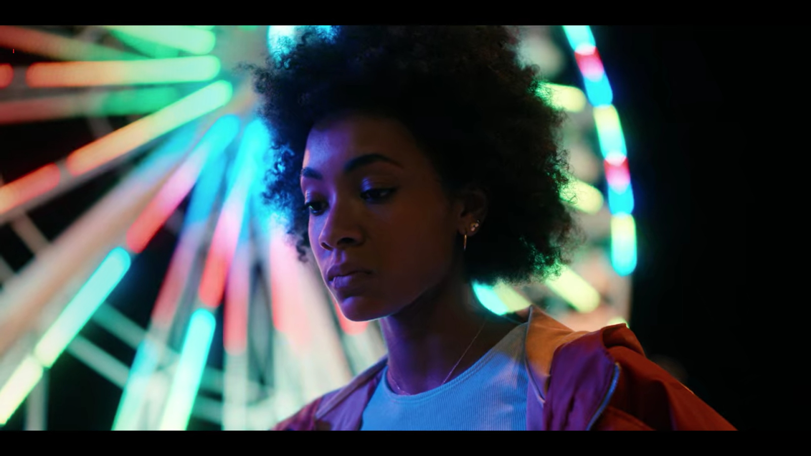
And if I had to pick a whole scene, the ending sequence of episode 03, the one closing up with the Ferris wheel. From 27 minutes on. My favorite so far!
I have seen the Series 2 times! I loved it!!

Did you see Euphoria, the HBO series? I think you would love the use of colors, depth of field and contrasts!
Thanks a lot for your time, Valerio.
Valerio's Instagram: https://www.instagram.com/valerioliberatore/
Marco Coradin's Instagram: https://www.instagram.com/marco_coradin/

